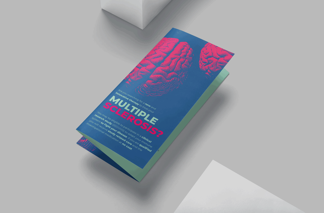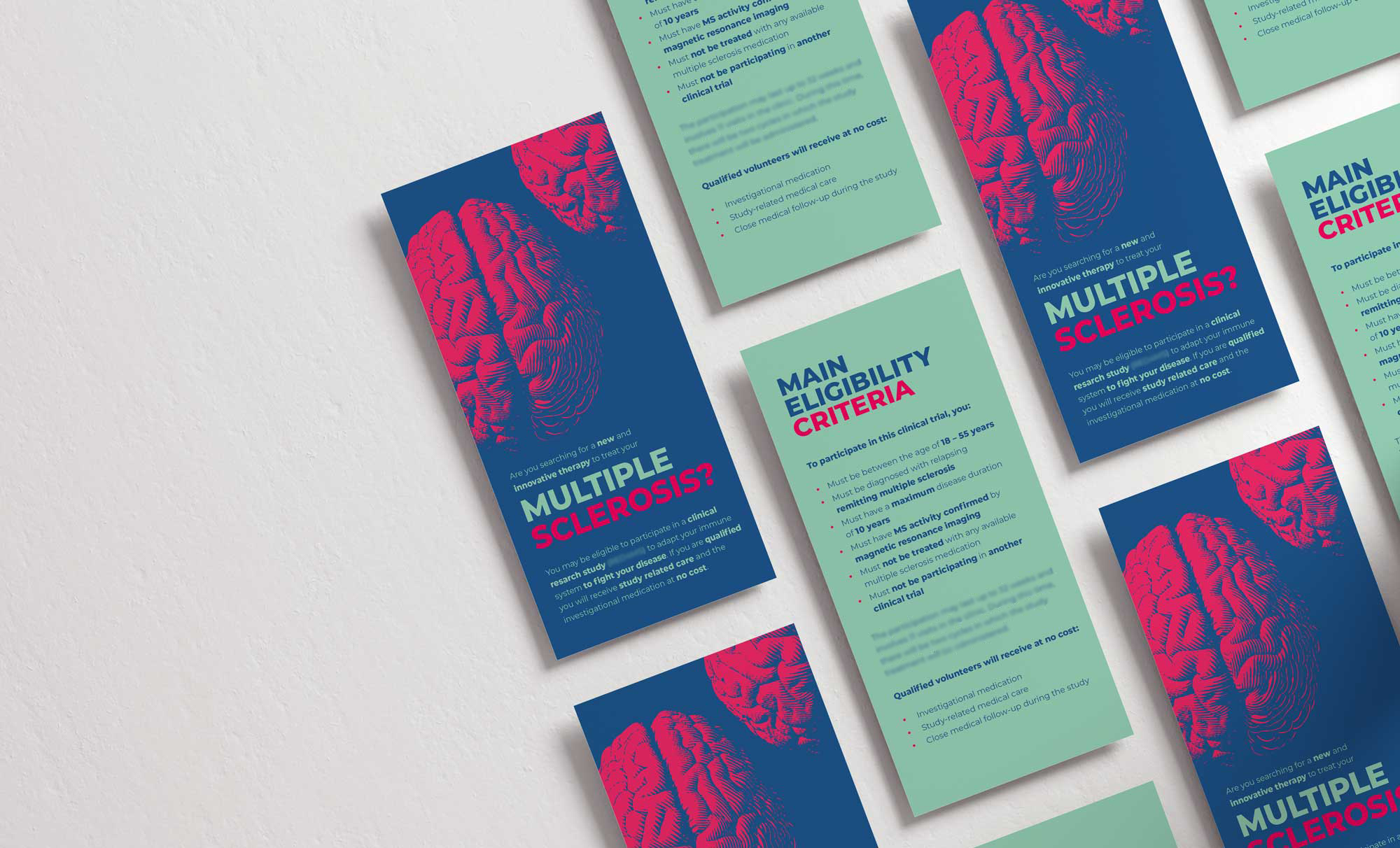

For the layout of our multiple sclerosis study, we chose bright red, dark blue, and cyan for strong visual contrast. Given that multiple sclerosis (MS) is, in part, a condition affecting the mind, featuring a prominent red brain as a captivating focal point on the top half of the flyer makes for an ideal eye-catching element. By utilizing strategic color accents, the study's main message can be readily understood.
Approximately <span style="color:#e72a64">2.8 million people worldwide</span> are currently affected by multiple sclerosis (MS), making it a highly prevalent disease that primarily impacts the central nervous system, encompassing both the brain and spinal cord. MS has a wide range of symptoms such as impaired vision, muscle weakness, tingling sensations, instability, cognitive difficulties, and persistent fatigue. <span style="color:#e72a64">Right now, there is no cure for multiple sclerosis. That is why clinical studies in this field are so important.</span>
\ branding
\ logo design
\ posters
\ flyers
\ meeting agenda
\ sticker


There’s much more to see.